App Dashboard
Understand how your business is performing with the most important, up-to-date data, whether you are at the restaurant or a popup. Tebi’s dashboard shows details of your daily operational performance, so you can ensure that your business is healthy by the end of the month.
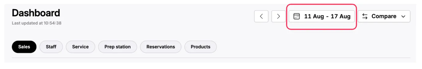
At the top of the page you will find the date selector to choose the time frame you want to look into. Either a day, week, month, year, or custom dates.
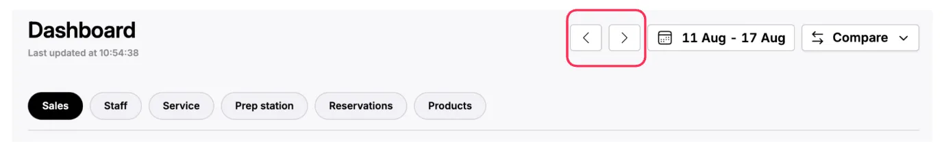
On the left of the date selector you will find arrows, to the left and right, to move to the previous, or next period.
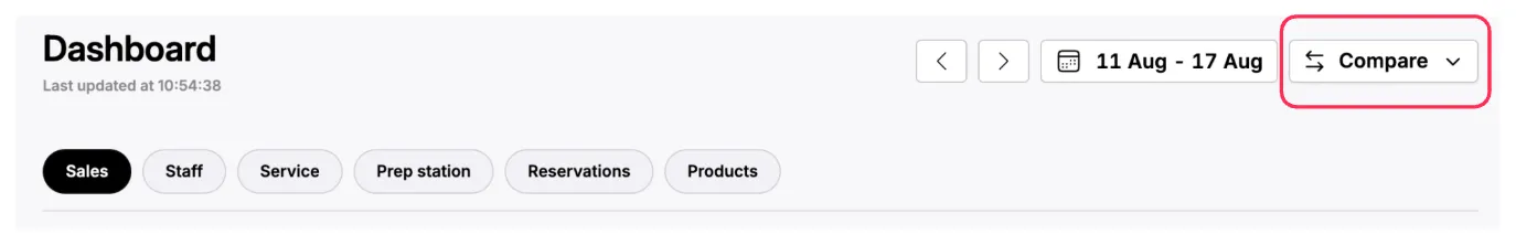
On the right hand side of the selector you will find a comparison button, to look into how this period performed versus a different one.
Once you have selected the time frame, you can go through the tabs to deep dive into the different areas of your business.
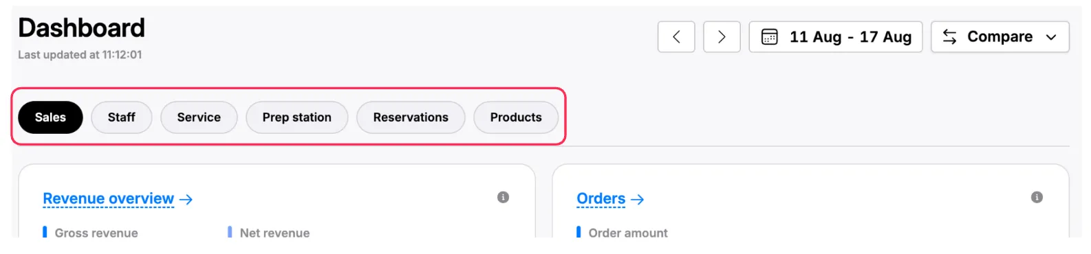
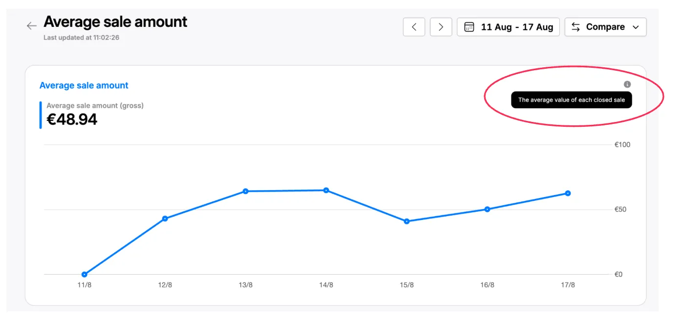
🧭 At the top of each page you will find the most relevant indicator for each category; as you scroll down you will find the indicators that impact it.
-
For example in the Sales tab you will see Revenue at first, and can then deep dive into number of orders, average sale amount and more as you scroll down.
-
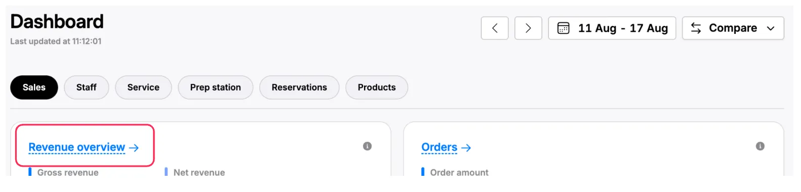
You can look at the charts to get a general idea for each metric, and can also click on each chart’s title to find a detailed view as well as a table with its source data. *Charts that have a detailed view will be underlined with a dashed line.
-
💡 To learn more about how each metric is calculated, you can hover over the tool tips (circle with an “i” in the middle).